Prerequisites
- A working project, that uses react.
- Basic knowledge of hooks
Skip to The snippet for the result.
The read more button
Sometimes you may have a lot of text, that takes up most of the space on your page. And you don’t want that. You want to give the user the option to read that text if they find it interesting by showing 2 or 3 lines of it and a show more button. This is what we have to do:
The problem
This case might seem easy, but we have to take into consideration a few things.
The text can and probably will contain HTML tags. This we cannot split the html string at index 200 for example and expect nothing to break.
The other thing is that devices differ in size. If we have no tags and split the text at index 200, it would be 2 lines on desktop and 6 on mobile, which is not consistent. We also should know when to show the “show more” button. For example when the text is shorter than 200 symbols, we must not show the button, for the entire text would be visible.
We ought to take into consideration the resizing of the screen as well. PCs have resizing windows, and our text must not break.
What does that mean? We have to show a consistent number of lines on each device. They must also stay consistent on resizing and the HTML before the cut must function and not break. We also should not show the button if the text is shorter than these two lines.
How to do the magic
- We must listen to the screen resize and adapt the component
- We must know when to show the button
- We must make the button work both ways
- We must not break HTML
Easy peasy. We will NOT be chopping up text. Instead, we are going to use a CSS feature, called line-clamp. And yes, I know that support is limited, and by limited I mean that it does not work on Internet Explorer and it uses a prefix, but here we do not care about IE. If you use IE, I am terribly sorry…
You can check the availability here .
We also are going to use TailwindCSS for the snippet, but I am going to provide a normal CSS snippet aswell.
Let’s get started.
The component
Let’s create a component that accepts div props and has a button.
import React from 'react'

export default function ShowMore({
  children,
  ...props
}: React.DetailedHTMLProps<
  React.HTMLAttributes<HTMLDivElement>,
  HTMLDivElement
>) {
  return (
    <section {...props}>
      <div data-wrapper>
        <div>{children}</div>
      </div>

      <button>Show more</button>
    </section>
  )
}
We can pass React children to this component, as well as all the other props that a div accepts. If you have an HTML string that comes from your CMS, you can also modify this component to use dangerouslySetInnerHTML to pass your string and render it inside the wrapper. Make sure to use a library like node-html-parser to remove any malicious code if your source is untrusted.
Now let’s add a line clamp from Tailwind and a state that controls it.
import React, { useState } from 'react'

export default function ShowMore({
  children,
  ...props
}: React.DetailedHTMLProps<
  React.HTMLAttributes<HTMLDivElement>,
  HTMLDivElement
>) {
  const [isExpanded, setIsExpanded] = useState(true)
  return (
    <section {...props}>
      <div data-wrapper>
        <div className={isExpanded ? 'line-clamp-2' : ''}>{children}</div>
      </div>

      <button onClick={() => setIsExpanded((ps) => !ps)}>Show more</button>
    </section>
  )
}
If you don’t use Tailwind, you can kindly steal their implementation and use it inside your CSS.
.line-clamp-2 {
  overflow: hidden;
  display: -webkit-box;
  -webkit-box-orient: vertical;
  -webkit-line-clamp: 2;
}
.line-clamp-none {
  overflow: visible;
  display: block;
  -webkit-box-orient: horizontal;
  -webkit-line-clamp: none;
}
Cool! We have a line clamping feature that cuts the text after 2 lines. Sweet. And it even works with HTML tags! But now the fun part. If the text is just a few words, the button will still show up. And another case - the text might be 3 lines on mobile, but just a line and a half on desktop, which means the button must be there on mobile, but not on desktop.
But how do we know when the text is clamped, so that we can show the button? Well, when an element is overflowing (what the line clamp does), its height is reduced, but the scroll height, (or the height of its contents) is still the same. That is what we are going to check.
Let’s create a ref for the component and add a resize event to the window.
export default function ShowMore({
  children,
  ...props
}: React.DetailedHTMLProps<
  React.HTMLAttributes<HTMLDivElement>,
  HTMLDivElement
>) {
  const contentRef = useRef<T>(null)
  const [isClamped, setClamped] = useState(false)
  const [isExpanded, setExpanded] = useState(false)
  useEffect(() => {
    function handleResize() {
      if (contentRef && contentRef.current) {
        setClamped(
          contentRef.current.scrollHeight > contentRef.current.clientHeight // we check the height here
        )
      }
    }
    handleResize() // we call it on mount
    window.addEventListener('resize', handleResize) // we also call it on resize
    // we destroy the listener on unmount
    return () => window.removeEventListener('resize', handleResize)
  }, [])

  return (
    <section {...props}>
      <div data-wrapper>
        <div ref={contentRef} className={isExpanded ? 'line-clamp-2' : ''}>
          {children}
        </div>
      </div>

      {!isClamped && (
        <button onClick={() => setIsExpanded((ps) => !ps)}>Show more</button>
      )}
    </section>
  )
}
And there we have it. A show more button that is there only when needed, doesn’t break the html tags when clamped, shows the same amount of lines on desktop and mobile, and is “responsive-friendly”.
All we have to do is extract it to a hook so that we can reuse it.
The snippet
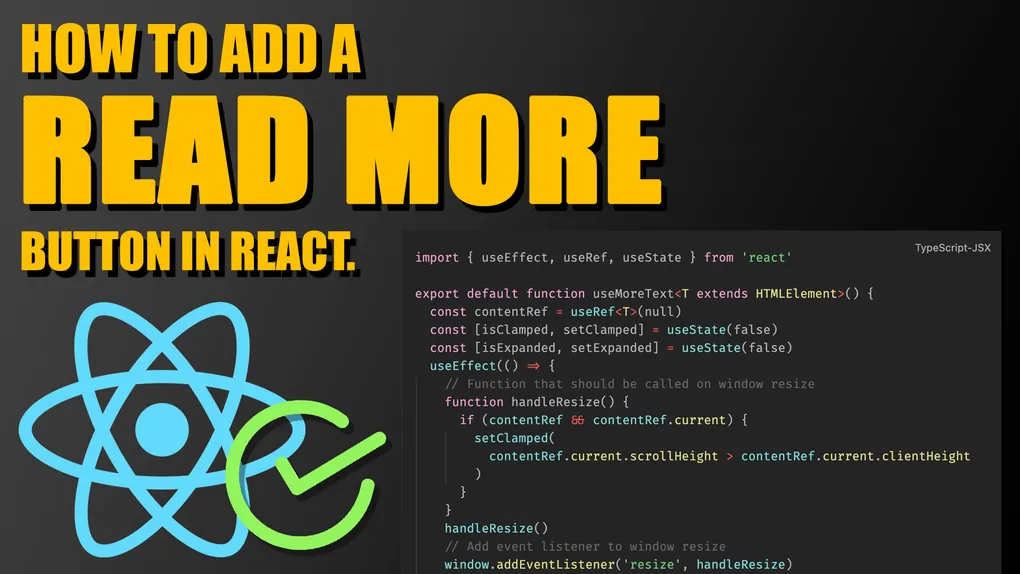
import { useEffect, useRef, useState } from 'react'

export default function useMoreText<T extends HTMLElement>() {
  const contentRef = useRef<T>(null)
  const [isClamped, setClamped] = useState(false)
  const [isExpanded, setExpanded] = useState(false)

  useEffect(() => {
    function handleResize() {
      if (contentRef && contentRef.current) {
        setClamped(
          contentRef.current.scrollHeight > contentRef.current.clientHeight
        )
      }
    }
    handleResize()
    window.addEventListener('resize', handleResize)

    return () => window.removeEventListener('resize', handleResize)
  }, [])
  return [contentRef, { isClamped, isExpanded, setExpanded }] as const
}

export function ShowMore({
  children,
  ...props
}: React.DetailedHTMLProps<
  React.HTMLAttributes<HTMLDivElement>,
  HTMLDivElement
>) {
  const [contentRef, { isClamped, isExpanded, setExpanded }] =
    useMoreText<HTMLDivElement>()

  return (
    <section {...props}>
      <div data-wrapper>
        <div
          ref={contentRef}
          className={cn(isExpanded ? '' : 'line-clamp-2', props?.className)}
        >
          {children}
        </div>
      </div>

      <button
        // don't focus the button when it's invisible
        tabIndex={isClamped ? undefined : -1}
        type="button"
        // invisible button to not disturb the page flow
        className={cn(isClamped ? '' : 'opacity-0 pointer-events-none')}
        onClick={() => setExpanded((ps) => !ps)}
      >
        {isExpanded ? 'Show less' : 'Show more'}
      </button>
    </section>
  )
}
About the author
Vasil Kostadinov


Software developer, specializing in React, Next.js and Astro for the frontend, as well as in Supabase and Strapi for the backend. Creates content in all shapes & sizes in his free time.